Friday, December 5, 2014

I wonder, just what is it that makes today's homes so different and so appealing?

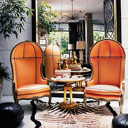
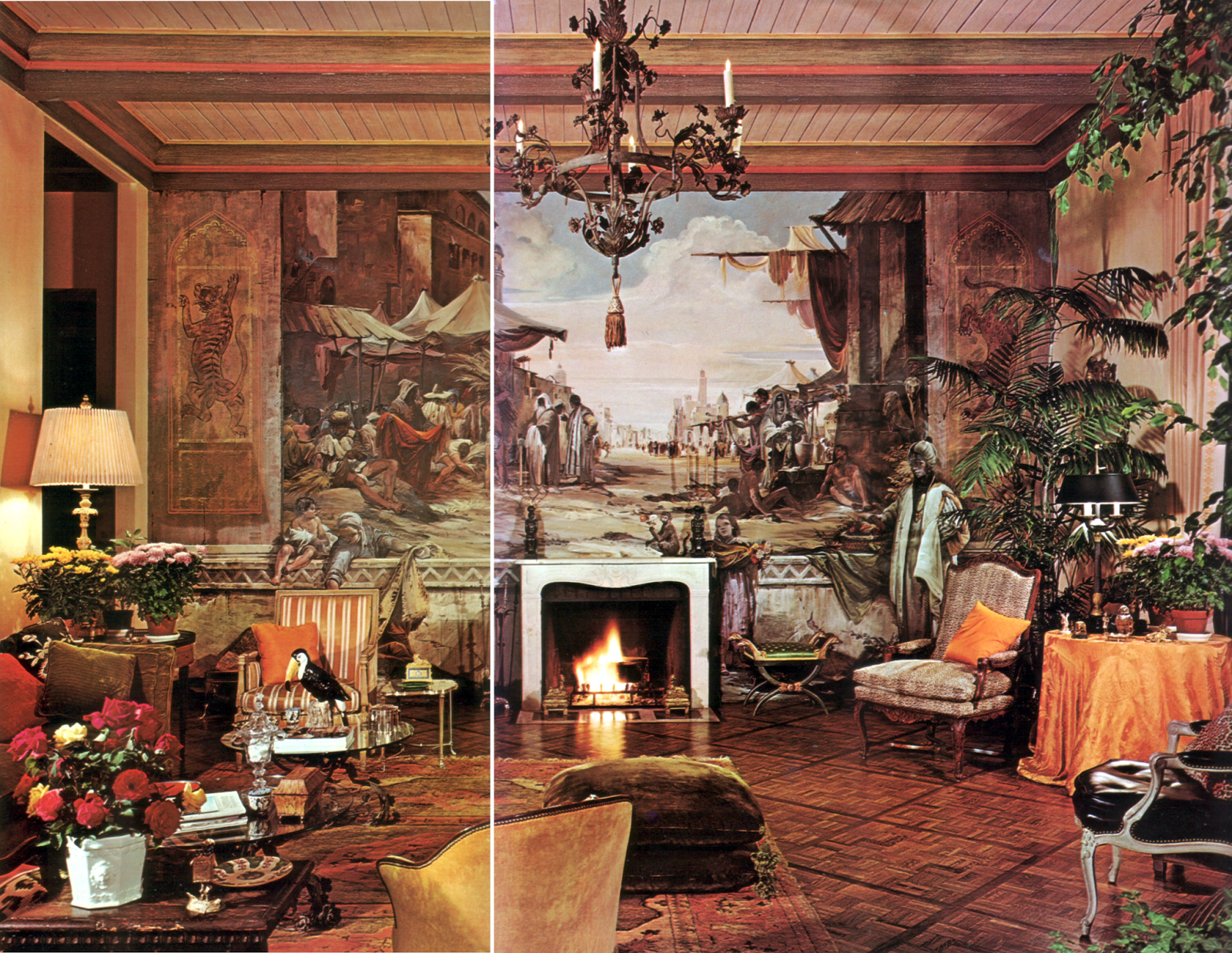
I'm getting rid of a lot of books about interiors ... not so much books about design, rather books about decorating and decorators I hadn't looked at from one year's end to the next. I thought one day as I went to get a book from the shelves, that the differences between the decorators are mostly superficial – this one uses color, that one does not, etc – and that all of them, be they "traditional" or "contemporary" decorators, work within the narrow confines of Romanticism. Nostalgia for an apocryphal society and worship of a counterfeit glitterati has led, finally, to nothing more than a fool's paradise of branding by tastemakers who, seemingly, do not need any talent beyond self-aggrandizement.


It really is quite remarkable how little there is to differentiate these decorators, despite protestations to the contrary on covers and in blurbs, one from the other. Two wine shipping boxes full of these books are now gone into the hands of someone who may learn from them. 


I'm co-opting Richard Hamilton's 1956 collage title as my own because it is the perfect question to ask about today's homes: just what is it that makes today's homes so different and so appealing?

For me, and I do realise I'm on the verge of becoming a crosspatch about decorating, there's very little that makes today's homes either so different or so appealing. It's thanks to interior designers like Chester Jones, Tino Zervudachi, the late David Collins, Terry Hunziker, and, in his own quiet way, David Kleinberg, that I don't feel totally discouraged by the mediocrity that has taken over the industry, the salesrooms, the auction houses, the publishing houses and the blogosphere. I'm almost there; total discouragement, that is.

What troubles me the most is the way design has been supplanted by branding. Look at the following quotation from the Aerin Lauder dissertation on the Lee Jofa website – Lee Jofa being one of a number of companies in interior design that have used celebrity as a marketing tool. I think the quotation explains clearly the modern process of creating a "designer collection."

"Developed through a combination of original design and interpretation of Lee Jofa’s extensive archives, several pieces in the collection demonstrate Lauder’s love for natural elements, from birds to florals. The classic, yet modern, color range includes rich, vibrant reds, soothing forest greens, beautiful blues, and strong, timeless neutrals."

I make no comment on Lauder, her products, or those of any other "designer" but when an industry in its entirety gives itself into the hands of brand creators, fashion marketers and licensers then a fundamental  break with the history of design has been made. Quite why I should be so unamused by all this is inexplicable, for it isn't as if this is a new process: it was in the 1960s that the French couturier began a system of licenses that he applied to fashion, and it was he that first displayed a logo on clothing.

I think this might well be my last post. I have had a good long run and met some good people along the way and have never met with negativity. Thank you, Ladies and Gentlemen.

It's time.

Sunday, November 16, 2014

Task lighting for the louche and the amaurotic


It was the way it was: our friends, hitherto as softly focused as Lucille Ball in Mame, complaining I kept the dining table too bright, and I going around my own house turning all the dimmers to screeching max. Then I went the eye doctor about what might, in some quarters, have been considered a miracle – I did not need reading glasses any longer and, to cut a long story short, thirteen months and three prescriptions for distance glasses later, not only are our friends in sharp, if Botoxed, focus (even across the dining table) but I can see everything on my plate – if they leave the damned dimmers alone, that is. 


I do not understand the need for so-called romantic lighting – Rex Whistler's scenario from my copy of The Konigsmark Drawings apart – but to me all lighting is task lighting, even if that task is creating a mood. It is my distinct opinion, and one I want to have chiseled into every restaurant designer's black heart, that romance does not equate with blindness. Overall, so formulaically dim is restaurant lighting in this city, and so little relation does it seem to have to the physical spaces (the metaphysical I shall leave out of the argument) I've begun to wonder if "design," beyond the necessary calculations, is even part of the equation. 


Oddly enough, restaurant lighting is only peripheral to my thoughts today, for what I'm most concerned about is not just lighting what I'm reading but, increasingly, where I find it easier to read. My iPad, easy to read wherever I am, is not part of this because it makes its own light. The two books here and the one I recommended a few weeks ago, The Interiors of Chester Jones, (still a book occupying my thoughts) are not easy to read in either of the ways I have until recently preferred – flat on my back on the sofa or with the book on my lap as I sit. What I have found is that our dining table is becoming my preferred place to read large books. In the morning, the rising sun floods the table, making any book and a cup of coffee a splendid way to begin the day and thanks to the Celt's refusal to have a chandelier blocking the view of his favorite art, there are downlighters that illuminate the pages if the day is dark.


Houghton Hall: Portrait of an English Country House by David Cholmondeley and Andrew Moore is an excellent read. Beautifully photographed, in the main by Derry Moore, and fluently written, it is a substantive (to use a dear friend's favorite adjective) book worth buying and reading. Guaranteed to make any expatriate homesick for a visit to the old homestead or a toddle down the lane in the rain. It is a magnificent house beautifully cared for, and it is wonderful that finally there is a book worthy of it. There's a beautiful photograph towards the end of the book of the owner, his wife and their whippet, in warm shades of gray. Super. 


A friend who'd visited with the subject of the book loaned me her copy of One Man's Folly: The Exceptional Houses of Furlow Gatewood by Julia Reed with a Foreword and Afterword by Bunny Williams. It is a very pleasant book and I'm glad I didn't buy it. 

Tuesday, November 11, 2014

Lest we forget

The Unknown Soldier

The Known and the Loved

Lest We Forget

Sunday, November 2, 2014

SPLAT

"Might as well turn 'em into handbags now," I thought when I read that there were only six white rhinos left. "Some spokesperson could rabbit on about freezing the poor beasts' DNA against a utopian time when science will resurrect all the beasts mankind has made extinct – thereby justifying the slaughter and be a lot cheaper than keeping them in a game park." Cynical? Dead right, if you'll pardon the pun.

The news set me thinking of friends of mine, with their liking of "hair-on-hide" mid-century chairs, and, by extension, of the history of animal parts in decoration – and there is a long history of this usage. Our Brno dining chairs are upholstered in a leather so fine it could be pleather but, besides shoes and belts, there are no other bits of dead animals lying around the place. Not for us that by-product of the industrialized source of steak, the cow-hide rug, or even hipster Mongolian lambskin pillows, and certainly no taxidermy (however beautiful the butterfly wings and beetle carapaces might be) or, for that matter, horn-legged furniture. I don't even like antelope- or leopard-patterned carpet – there's something faintly ridiculous about reproducing a natural pattern in such a way it resembles nothing more than a cosmic skid mark of roadkill on the floor.


Then, on another blog, I read that some purveyor of zebra skin rugs and pillows had "reached out" to the blog author about their wares and, my distaste at that awful piece of cant used instead of "contacted me" or "wrote to me" apart, I realized how unremarkable it is to see zebra skins on floors and furniture, and there I was, in my innocence, thinking zebras might be a protected species. I suppose they are farmed and funneled to a processing plant and emerge ready for the sofa and the floor. Zebra, undoubtedly, is the upper-class version of the cow-hide rug available to everyone at Ikea for $199.


My problem with it all is this: in my early student days I was allowed into a slaughter house to photograph the proceedings and I have never forgotten the cries of those cows and pigs when they were lined up to be killed. I have never forgotten how pigs scream like human beings. I have never forgotten the the sound of abject sorrow a cow makes when she knows she is going to die. It is those cries, as inarticulate as any I might make in extremis, that I remember each time I see a hide-on chair, a cow-hide or a zebra-hide rug and I wish I didn't.

On the other hand, advice for cows or zebras learning to fly and wishing to avoid the SPLAT of a none-too-soft landing, from The Hitchhiker's Guide to the Galaxy: “The Guide says there is an art to flying", said Ford, "or rather a knack. The knack lies in learning how to throw yourself at the ground and miss.”


I chose two beautiful rooms to illustrate this essay about a purely personal reaction which in no way reflects on the designer's choices or anyone else's for that matter. The bedroom is by McMillen Inc, and the blue room is by Todd Romano. I found the photographs and the photographers unattributed on other blogs via Pinterest. The third room, found on tumblr, has it all!

Tuesday, October 28, 2014

Rustic Chic


We spent part of the weekend in Highlands NC, at our friends' cabin. A simple, rustic place it is not; architecturally, it might resemble the log cabins the Finns introduced to America but the kinship isn't close. Wise enough to leave the structure as they found it, and knowing only too well the so-called mountain style available locally, our friends employed a young Atlanta designer, Niki Papadopoulos, to furnish and decorate the place. No easy job, I think, given client's requirements, budget, and the physical limitations of a two-story cabin (placement of doors, hallways, etc., ) but it is a successful one. There's nothing even faintly resembling an "Orkney" chair or any other form of rusticity (one exception is a belated housewarming gift of a fox doll given by a friend which perches on the fireplace against the frame of a beloved painting by the late mother of one of the owners), and certainly nothing that indicates any understanding of straw (see below). 


One of life's pleasures, and one so easily forgotten when one lives in a high-rise, is a Saturday morning on the sofa reading in front of a fire. My friend David had the Sotheby's catalogue of Mrs Paul Mellon's Jewels and Objects of Vertu which for him, as a jewelry designer and certified gemologist, is of great interest. I find objects of vertu endlessly fascinating though I am not given to whole troves of them spread out over our table tops, but two of Mrs Mellon's caught my eye. One, the tri-color gold box resembling overlapping oak leaves by Verdura and the second, a gold, gem-set and enamel table ornament in the form of a pomegranate, also by Verdura. I could clear a surface or two for those.


Mrs Paul Mellon, repeatedly, whilst alive and despite an indomitable guarding of her privacy, was epitomized as a nonpareil of taste and, now that we can see some of her interiors, she seems to have enjoyed large pleasant, conventional and discrete rooms – so ordinary unstudied, in fact, some people are hard-pressed to find anything spectacular about them and are reduced to making quite silly statements about her. Before you read the following from Miles Redd, let me say I have nothing against understanding straw, settees, (even when pronounced settays), "Orkney" chairs or, even, Mr Redd.

"Someone very grand  once told me that it takes a lot of style to understand straw, and I do believe Mrs Mellon almost invented that notion. To be able to see the rustic chic in an Orkney chair and then walk to the other side of the street and appreciate the refined curves of the gilt and chalk Settee takes a special eye, and she had it."

The Orkney chair – given its present-day form in the late nineteenth-century. The original developed in circumstances in which these modern-day extollers of "rustic chic' would be horrified to find themselves. 


In conclusion: who would not wish to have had time in Mrs Mellon's library, browsing her books and, taking advantage of her hospitality, read at leisure as fancy struck. I, for one, would have loved it.


Sotheby's Auction Lot 930 A Scottish Pine and Rushwork 'Orkney' Chair
Estimate $200 - 250

Sotheby's Auction Lot 42 An 18 Karat Tri-Color Gold and Colored Diamond Box, Verdura
Estimate $15,000 - 20,000

Sotheby's Auction Lot 39 A Gold Gem-set and Enamel Table Ornament, Verdura
Estimate $10,000 - 15,000


Photographs of Mrs Mellon's tricolor gold box, pomegranate table ornament, and books from the catalogue.

Monday, October 20, 2014

Running on Low

I apologize for being tardy in replying to your comments on the last post. Strangely enough after my week away in New York, Philadelphia and Washington DC I am running on low. I should be back by the end of the week. 

Running Satyr Boy Holding an Owl
Claude Michel known as Clodion


Of all the splendors of the Philadelphia Museum of Art it was the minor grace of Clodion's Running Satyr Boy Holding an Owl that caught me.

Friday, October 10, 2014

Times Past and Times Present

Does anyone remember a world without hostess gifts? Am I the only one who objects to taking along a bottle of wine every time I step out of the door for dinner at a friend's house? Is any one of us nowadays unused to a nibble with a cocktail? I remember when the, to me abominable, habit of taking along a bottle of wine began, and I was as sure then as I am now that it was a result of salesmanship aimed at the genteel classes – people anxiously persuaded that the path to Salvation meanders through the countries of Graciousness, Fine Chinah and Regifting. Apropos cocktail nibbles I came across the following whilst reading Michael Innes's A Connoisseur's Case. Times change, indeed. 

“But, Uncle Julius, wasn’t it only rather earlier that people were transported for poaching?’
‘Was it? The more’s the pity.’ Colonel Raven put down the decanter, picked up a plate of small cocktail biscuits which had been set on the tray beside it, carried these over to the hearth, and there emptied them into the low fire burning in it. ‘My people are all dunderheads,’ he said. ‘Impossible to get them out of these damned vulgar habits. Got hold of them in London hotels, I suppose. What did you say, my dear?” [The italics are mine.]

Porter's chair, allegedly from the Bank of England Museum

From another of Innes's tales, again with the same hero, John Appleby, a quotation about changing times but only obliquely so – about a perfectly functional piece of furniture that, for some, has travelled up the social ladder and changed sex, whilst, for others, it should have remained where and what it was.

"And Appleby grabbed Judith by the wrist and hauled her within one of those curious contrivances, midway between a sentry-box and a family sarcophagus, which the eighteenth-century considerately provided for the porters in its draughty halls." [Again, my italics.]

BG Restaurant, Berdorf Goodman
Photograph Bergdorf Goodman

I first saw the modern, more fashionable version that is used, for example, in the Kelly Wearstler-designed BG Restaurant at Bergdorf Goodman, forty years ago in Harrods and still I loathe its ill-proportioned conceit. The Horrids version, if I remember rightly, came from Italy and was to be found in its Decorative Furniture department. I've seen it in "antique" leather, in linen, in velvet, buttoned and not, and in wicker. But what I haven't seen, though it must have existed, is one with a liftable seat above a chamber pot – the cause of much tittering and blushing in the shires cul-de-sacs of this land if a chamber pot were even to be recognized for what it is.

I make no comment on Ms Wearstler's version except to say I have never sat in one on any of the occasions I have eaten at BG. The following quotation from One King's Lane may give some hint as to why.

"The Fabulous Porter Chair"
Photograph from One King's Lane

"These dramatic high-backed chairs are most recognized as the seats of power for ladies who lunch at the Wearstler-designed restaurant BG in New York’s Bergdorf Goodman department store. Irresistibly feminine, the canopied chairs are a Marie Antoinette dream come true."


Speaking of ladies who lunch, the last time we were in BG, we sat next to two young women speaking English and French interchangeably, in that easy way that only people with absolute fluency in both languages can – one, it transpired, the Executive Vice President of Laurent-Perrier U.S., the other the Direction de la Communication et des Relations Publiques in France. We had extended cross-table chats and much Laurent-Perrier champagne; so much so, we were only capable of an afternoon nap rather than our planned quick canter around the Jeff Koons retrospective at the Whitney (which, it occurs to me now, might well have benefited from the Laurent-P we'd imbibed). A few weeks later, from one of those ladies at lunch, arrived this lovely and very useful champagne bucket, together with a set of flutes. A delightful and very generous gift that has been the object of none too-subtle hints by would-be regiftees!


This morning we leave for New York – friends from my university days are visiting this country for the first time. and we are joining them for a few days of museums, opera, cocktails (with nibbles), lunches (at BG, Jean-Georges, etc) and the postponed visit to the Jeff Koons retrospective (described by my brother-in-law, as the high-fructose corn syrup of modern art). Thereafter we're driving to Philadelphia and thence to Washington DC and I hope to be blogging whilst I'm away. 

Monday, October 6, 2014

The Interiors of Chester Jones, a recommendation


"It is neither realistic nor desirable to see homes in terms of antique or modern, classical or rationalist. For one thing, in this age of eclecticism there are so any styles. Is it right, with regard to the design of interiors, to believe that only one style is valid, given the proliferation of architectural and fine-art theories? The only judgement that is valid is to avoid the strict historicism in which every effort goes into the recreation of a single moment in time past. It is disheartening, for example, to see people awkwardly occupying Louis XVI-style rooms, accessorized to the last period detail, in a New York apartment of completely inappropriate proportions, but it happens. Likewise, the taste for English eighteenth-century-style rooms, often with very good furniture – in new houses is still prevalent. It is just as disappointing to see apartments fitted out with mid-twentieth-century furniture, fittings and artifacts designed by Jean Prouvé and Charlotte Perriand, along with light fittings and accessories by the best designers of the day. Driven by nostalgia, this is little more than the same problem but with focus on the twentieth century. The impulse to assemble the contents of rooms within a narrow historical tradition continues. However, such an emphasis on a limited range of ideas, as brilliant as they might be, sits uncomfortably with today's interest in personal, idiosyncratic expression.

"This is not to suggest that eighteenth-century fauteuils, English Georgian furniture or even the great modernist pieces should not be used; they obviously should, and should be enjoyed. It is rather that the various pieces are better used as a counterpoint in an interior, or to perform a function, rather than to conform to the static programme of some period tableau."


Until Friday afternoon when I walked into Barnes and Noble I had not known of this book's publication. Of all that was on offer, this book was the only one of interest to me. I have written about Chester Jones before (see side bar Labels) and he belongs in my own pantheon of erudite designers. 

The first paragraph of this post, a quotation from the book, introduces the man and his work very well, I think. The book, simply entitled, The Interiors of Chester Jones, gives beautiful examples of his interiors, furniture designs, design philosophy and his method of working. Hitherto, his interiors were only seen in the pages of The World of Interiors and I am very thankful to have an expanded and thorough collection of Mr Jones's work to hand. I cannot recommend it more highly. 

Chester Jones's own sketch for a table inspired by Vladimir Tatlin's Monument to the Third International 1919 (below from Wikipedia Commons. See photograph above by Andreas von Einsiedel from an article written by Chester Jones, The World of Interiors, December 1995)


Photograph by Fritz von der Schulenberg, from The World of Interiors, October 2005.


 Hand-drawn floorplan and elevation from The Interiors of Chester Jones 
The type of illustration that illumines the process of interior design 
and gives life to the design of a book and to the reading of it


Nota Bene: I received nothing for this recommendation except the enjoyment of making it.

Friday, September 26, 2014

Baton Bob and Synonyms in Decoration


During a pre-theatre (Gilbert and Sullivan's HMS Pinafore) dinner recently, I watched eight identically-dressed young women walk by our table – long blonde hair, flimsy dresses and clumpy shoes – a look not improved by the effects of the late-summer storm they'd just arrived in. Obviously, I thought – as I munched on black rice, butternut squash, golden raisins, and cilantro with brazil nut pesto – no-one had noticed or maybe cared that the tipping point had been reached – the point beyond which fashion becomes uniform, and individuality apparent only in the unsuitability of the raiment for the figure, rather than in any other way.

I'm not so much of a believer in barroom psychology, but I did wonder that evening if group dynamics require such conformity of dress and, indeed, if group norms apply in interior design. It could be said that there is conformity in design judging by what is visible on Tumblr, Pinterest and blogs; but lacking any scientific data, I'll have to rely solely on my jaundiced eye.


Baton Bob, the figure in the two photographs above and a much-loved character (by me at least) in Atlanta, is often to be found strutting his stuff on Peachtree Road. His whistle is the first indication he is somewhere around, and I wish I could tell you how happy I was at seeing a bride shining in the shade by the side of the new mixed-use development, where only the day before the Celt and I had been stranded in a mosquito-infested, unfinished space without any means of exit (try explaining to 911 that the space where you are trapped is part of a complex called Buckhead, Atlanta that itself is located in Buckhead, Atlanta. Talk about a comedy of errors!) Without taking this sighting of Baton Bob too seriously, for me he represents the Individual, the Jester, if not the Fool of the Tarot, in a sea of conformity.


So, where am I going with this? I'd like to say I intend to post pictures of interiors that represent a certain individuality, but as I write I wonder, despite the wonders of Tumblr and Pinterest, if there might be a paucity of imagery suitable to my task. The English, mysteriously to me, are considered to be eccentric, if only in their decorating. What I have seen of spaces considered to be individual or eccentric is that frequently they resemble the attics of down-at-heel aristocratic hoarders or, worse, the rural digs of the Bloomsberries – in short, an accumulation of kit and effect that makes one itch to clear the lot out.


I've also been musing about an occasional series called Synonyms in Decoration – about interiors that are out of the ordinary, don't shriek of trend and are perhaps representative of an idea not immediately definable. In other words, rooms that are individual fantasies in a conforming world.


It seems such a good idea yet I might fall flat on my face. In the way that it's easy to come up with a good title for a book but writing a book is a "hoooolnuther thang" as they say around here. So, with my own little ignis fatuus, as it were, by my side I'll begin with the title Synonyms of Fantasy in Decoration and go from there. 


In these photographs the synonym for fantasy is the illusory depiction of an ancient Arab bazaar, drawn in a Renaissance manner with life-size human figures that seem both to attend and ignore the viewer – the whole, mural, decoration and architecture, suggestive of early twentieth-century American travels in Italy and Venice.  Now, fifty-three years after it was published, this house, from a richer period of decoration than we know today, to my eye has depth, subtlety and refinement that is rare.


Group dynamics, then, would suggest that fifty years ago this house was not untypical but I wonder why it never became legendary (not a description of a house I normally like but it is in someway synonymous with fantasy). I wonder if the tide for mural decoration had already turned. It was only ten years later that the whole rage for faux finishes broke out and real picture-making on walls became stranded in an historical alley. But, that is a post for a hooooolnuther day. 

The owner of the house and the decorator was William Chidester.
The architect was Walter Wilkman AIA

The muralist, and the painter of the picture above, was Douglas Riseborough about whom I find very little online that is satisfactory.

Photographs by Danforth-Tidmarsh, published in Architectural Digest, March-April 1971

Thursday, September 18, 2014

Again, on the brink

A few weeks ago I stood at a window on the brink of the ancient bed of the River Tay marveling at the quality of the long twilight that so late that summer's evening began to fade and, with the day, the river itself, far away in its present-day course, washed away in the oncoming night.


And so it is, the Celt and I, in our own union of Scotland and England wonder and worry as we stand at yet another brink – the possible dissolution of a Union  three hundred years old. Heartbreaking, if it happens.


A photograph I took in the Victoria and Albert Museum of a Putto holding the Crown and Coat of Arms of Scotland circa 1686. Marble, perhaps from a Roman Catholic Chapel in Whitehall Palace, and probably carved by Arnold Quellin, 1653-86 and Grinling Gibbons 1648-1721.

Update: Scotland remains in the Union.

Monday, September 15, 2014

In anticipation of a book

The photographs below are from a post I wrote about Geoffrey Bennison nearly five years ago. In the Topics list in the side bar I find I wrote about Mr Bennison ten times, making him one of my favorites. Were there any doubt that he should be one of the most esteemed decorators of the twentieth-century, the publication of this book early next year should leave no doubt at all. 


The author is Gillian Newberry and Sir John Richardson has written a Foreword. Of all the books in the publishing lists for the coming months this is the only one with any interest for me. Gillian Newberry who had worked as Bennison's assistant founded Bennison Fabrics together with her husband in 1985 after Geoffrey Bennison's death. 


Published forty years ago these rooms remain to my eye remarkably undated. Greenery in baskets, even a plant in the summer fireplace date the photographs to the 1970s. That era's equivalent of today's clump of white phalaenopsis, ferns, ficus, etc, always looked a little self-conscious, as well they might given their role as swank purchases from the newly-established fancy garden centres. They didn't last long of course, those tropical parvenues, for the decidedly chilly air of social decline soon saw them off, their places cleared for the amaranthine qualities of silk plants and flowers. Even silk as a designation in this context has declined, I fear, for now we must say permanent. As a nomenclature permanent can cover a multitude of sins – from what once may even have been silk at its genesis, to what might well be its very worrisome end, resin. 

And that brings me in a very roundabout way to the subject of my next post but one – something that has been worrying at me for a while. This link to one of my favorite websites will give you a clue. 


Photography by Derry Moore from Architectural Digest November/December 1976


The book will be published by Rizzoli on March 24th 2015 – a long time to wait, I know, but I'm like a kid waiting for Christmas morning.