Sunday, August 31, 2014

Thursday, August 28, 2014

Vignettes in decorating

The first time I was confronted by vignetting in decorating was thirty years ago with an article in The World of Interiors and I did not react well. Living in Amsterdam at the time, these photographs reminded me of nothing more than the Metz & Co furniture showrooms diagonally across the Keizersgracht from our house and, still, all these years later, I find it hard to let go the idea of showroom vignetting – ironic, perhaps, given what I quote below from the original magazine text. I still wonder where those people actually lived.


"With all the architectural details, including the floor, painted white, the drawing-room becomes an intriguing limbo for a graphic collection of furniture. The colours are limited to black, bright red and a small amount of pale grey, so with this visual discipline the choice of objects in the room has to be precise and unerring. Some people might imagine that this is a very elemental solution to the problem of decoration and against the drama of a plain white background almost any object will be enhanced. In fact the reverse is true. Any flaw in design or proportion will show up immediately. The great pitfall to be avoided when placing things in a space like this is temptation to make small 'groups'. Although charming in themselves, if unrelated they give that restless showroom-like atmosphere, with every precious object pleading to be looked at. It is far more difficult to compose a balanced room so that the gaze can move about unmolested, taking in everything. Selecting the right pieces and putting them in just the right place to achieve this takes a great deal of skill." 


Undeniably beautiful, and equally beyond doubt designed to be photographed, these rooms have such an intense cerebral quality that makes one think they may well be haunted by the ghosts of brainstorms past.  Indeed, it is precisely that cerebral vignetted quality that pervades the rest of the oevre of the husband and wife team René and Barbara Stoeltie – where their own residences are concerned, that is. Shortly after this article was published the Stoelties took control of their own image, as it were, and she wrote the text to his photographs. For years I have disliked everything they have done even to the point of not buying books on which they have collaborated – so strong has been my prejudice (I can call it nothing else).

Having said that, yesterday afternoon I watched a video on youtube in which Barbara and René Stoeltie were interviewed and I began to understand not only their point of view but something I thought I already knew – the quicksands lying in wait for us all within our own language.  The video is in Dutch but for those you who might be able to understand the link is below. The Stoelties are not unsympathetic people and I was both glad and nonplussed to find that.


https://www.youtube.com/watch?v=6bxFo0T41Mg


I'm not beyond appreciating a decent vignette or two but, nonetheless, given what I see in the blogs et al, I feel we are on a downward slope – like once-chic macarons on sale in a cart at the mall,  vignetting has become a tool for anyone with a rainy afternoon, a pile of junk, some books, an iPhone and internet access to hand.

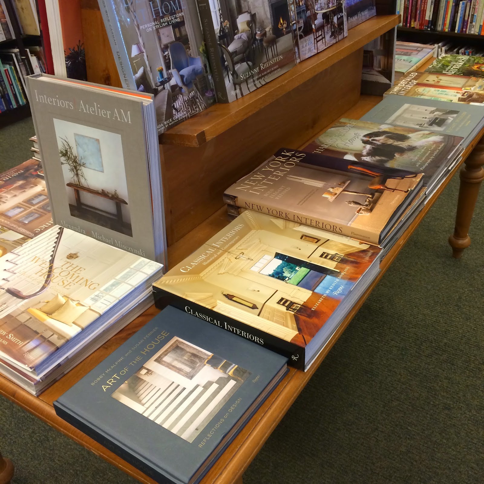
Previous generations deforested whole continents, captured Sabines, established cities on hills, conquered a colony or two, swaggered across oceans and planted vines in new lands ... but what do we do? We arrange our books according to color, we style our shelves, arrange pretty objects on tabletops, and then, not knowing our arses from our elbows meanders from our Chinese frets, we write whole blogs about them. There's civilization for you!

More of that next week.


I've said it before, and I'll say it again, democracy is a good thing but it ain't for everyone.

Quotation from text by John Vaughan and photographs by same, The World of Interiors, June 1984.

Friday, August 22, 2014

There's probably a reason why Friedrich Nietzsche didn't build houses

After a visit to the supermarket where, in one of those futile greetings exchanges, the manager informed me he was "blessed" I, humbled as I was to have been in the presence of one of the chosen and wondering if there was a national dress code for supermarket managers – pleated trousers, heavily starched shirt, co-ordinating tie, and Italian loafers – I set off for the bookstore.


I could say I'm not sure what I saw there says about interior design publishing but, frankly, I am sure – it's mostly dross and, in my local Barnes and Noble (the only bookstore within the perimeter as far as I know) there is shelf after shelf and table after table to prove it.


There's probably a reason why philosophers don't, generally speaking, build houses and there is likely a good reason why decorators shouldn't philosophize. Architects, on the other hand, are almost impossible to prevent from doing so, such is their training. Gobbledygook rules, etc. 

The following quotations from one of the books above, each a sentence a page, suggest tenets brought down from the mountain top yet the suspicion that the burning bush was merely a hollowgram cannot be dismissed. 

We want to be released from the invisible barriers that separate us from the natural world, but we also crave a comfortable place from which to do this – a pillow of moss or a warm rock behind our backs.

Returning home from expeditions, we bring back souvenirs – talismans endowed with nature's power to ground us with the knowledge that wealth comes not from wares, but from what lies around us.

Worldly goods have found their way to this house in the woods where they rub shoulders with finds from nature.

This house has no wanderlust. It knows where it is and is satisfied to be there.

Sentiments, to my mind, worthy of Pseuds Corner. However, the quotations above do fall into a major design category – vignettes. They are typographical vignettes in a book filled with photographic vignettes. 

Are vignettes a major design category? From the point of view that vignettes are heavily used in book publishing and on decorator sites – as if every vase, chair or table, Mr DeMille, is finally ready for its closeup – then vignettes are a category. They are, in my opinion, something more than filler, for in the blogging world vignettes allow enthusiasts to appear as professionals – so common have they become in the visual language of design. I wonder sometimes if by focussing this way the big picture is lost. 

Vignette as design is a theme I want to explore in the coming weeks. 

Tuesday, August 12, 2014

A piece of priceless piffle

The other day I found the photograph you see below in my inbox. From Germany, it was a short email containing the photograph you see below, a subject line "What can I say?" followed by "The irreverence for books...turned around to "neutralize the color statement.."


I have no indication of who took the photograph or where it first appeared or even why it was published though it's easy guess all three. Generally speaking, bloggers are not photographers of note – pressing a button on a phone does not make one a photographer – yet this unregarded fact does not stop any of us from showing our pix in a blog, this modern version of the post-vacation slideshow.

Anyway, my point is this: if you are going to make a statement such as this piece of priceless piffle – neutralizing the color statement, indeed – then make sure your photograph has the authority of professionalism. A well-photographed and styled vignette could enhance or, at best, detract from the fact that all the books and magazines are facing the back of the shelves, as if in shame. (It makes one wonder what goes on in that bed between the two Ikea lamps, the matching tables, and the serving dish used as a vase.)

Books have been treated prettily shabbily this last few years: as plinths; as pillows; as incidentals on objet-laden shelves; as trophies; as color-stories; as bundles, stripped of their boards and tied with string – in fact, as anything other than what they are. 

As an attempt at originality, turning book spines to the wall, is silly. 

Sunday, August 3, 2014

Four book reviews

From its foil-stamped jacket, embossed and gilded buckram cover boards, its moving tribute by his friend Muriel, the book about David Collins, ABDCS: David Collins Studio, is, as Muriel might say in one of her more Brit moments, "Brill!" The publisher, Assouline, as befits the work of this uncommonly talented architect and designer who died last year at the age of 58, has done a handsome  job with this book  by allowing the work to speak for itself across full-page and double-page spreads with little text – short paragraphs by Collins that have none of the usual philosophizing guff that all-too frequently gets spouted these days.


The book will look quietly glamorous on the coffee table, especially if left open at the double-page photograph of the Delaire Graff Estate, Stellenbosch, or even better on the knees as one looks with increasing astonishment at the beauty on every page.


The William Kent: Designing Georgian Britain exhibition at the Victoria and Albert Museum is now closed but the catalogue, a hefty book, intellectually and physically, is still available. At over eight pounds in weight this book should be placed on a table of dining height to be dipped into time and time again.  


The third book, House Proud: A Social History of Atlanta Interiors, 1880-1919, loaned to me by my old prof, is something of an exception for me, for, generally speaking, I'm uninterested in anything that happens locally. The book reads like an academic thesis – no bad thing – and one written by someone who enjoyed herself writing it. It also has a curiously old-fashioned feel due to the book designer's use of coated papers and a curly, turn of the twentieth century display font. Atlanta decorating at the end of the nineteenth-century and the early years of the twentieth-century was no different from that in the rest of the country and, judging by the plentiful black-and-white photographs of overstuffed interiors, as suffocating as it must have been in the years before air-conditioning was invented. This book, though, is more than a book about decorating (it's a social history, after all) because it places these houses and rooms in the period after Reconstruction when Atlanta began its long journey to enter the modern world. 


Book four is actually book three of Deborah Harkness's The All Souls TrilogyThe Book of Life, a long-awaited work about magic, vampires, witches and daemons, time travel and all those other things that unite us, that has given me many an hour's enjoyment since I read the first book, A Discovery of Witches, three years ago. I'm one for re-reading and typical male, I suppose, I like a proper beginning, middle and ending, and lots of action within a credible, thus well-constructed universe. This trilogy has a proper ending that feels also like a new beginning in the sense of there could well be sequels.